Ravelry.com: User Interface
1. How does the opening screen introduce (or fail to introduce) the organizing system and search interface? For example, how easy or hard is it to find the displayed index terms as compared to the search box? Does your index have any 'hidden treasures', i.e., useful options in searching or browsing that are hard to find from the opening screen? Note that a well-organized opening screen won't necessarily give you direct access to all of the options the system offers -- you might have to click a few times to get to some of the options. But the opening screen should point you in the right direction.
Selecting the opening search screen (highlighted tab of a magnifying-glass at top right of the screenshot) leads you to a rather plain text page, in which all the displayed index terms, of the “advanced search” function, are accessed by clicking a heading (patterns, for instance, is highlighted via mouse-over in the screenshot).

Most users of Ravelry will be at least familiar with search boxes as a convention of the web, but they will not have a sense for the powerful displayed index, and facetted browsing of Ravelry until after they have made their first search.
In the screenshot below, a few facets of the displayed index for “patterns” (which is accessed via the “advanced search” option) is shown:

The difference between the opening page and the options available in the subsequent search page is quite large. These are dynamic, interactive tabs, rather than the static plain text of the hyperlinks on the opening page.
For the purposes of introduction, I think the opening screen sets the user up for success by not overwhelming them with numerous options at the outset: key top-level subject headings have been selected that will drive users to the appropriate facets for their search.
If, for instance, a user is interested in purchasing organic yarns, they can select the “yarns” tab of the advanced search on the opening page and limit the facets which appear to include only index terms which would apply to yarn documentary units. The screenshot below, in which the “sustainability” subheading of the “attributes” facet has been selected, shows such an index term:

All of the top-level categories are clearly outlined in the opening page, and making these categories clear to the user at the outset is helpful to drive traffic appropriately. A user interested in purchasing or downloading a pattern for yarn they already have will not want to sort through the documentary units of yarn exclusively; they will want to limit their search to facets of patterns.
The “jump to a filter” feature is a hidden gem that has hidden gems within it, and it can only be accessed on the advanced search page itself, at the top left, above all other facets:
Unselected, but highlighted below:

Selected, with an option under the “additional filters - not available on the sidebar” highlighted:

These “additional filters” are hidden facets that are not visible to the user until selected. They appear as pop-up windows when selected:
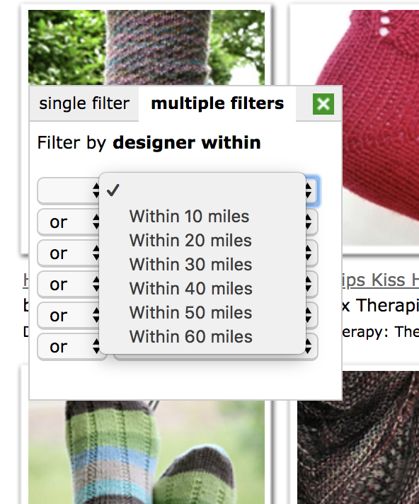
The “designer within” facet, above, would be helpful for users who are seeking to work with designers in their area, allowing them to filter results only to those who are “within x miles” of their location. This could help users identify local farmers, for instance, who sell yarn they make locally; purchasing directly from farms is a common practice among fiber enthusiasts, so this feature being so hidden was quite surprising to me.
However, the overall experience is planned well. The user is not overwhelmed by a flood of facets at the outset of their search. I think the limited selection of top level categories to drive user traffic to their main area of interest first is wise. It reduces the possibility that a user will give up from confusion before they begin.
2. What kind of search options does the system offer? For example, can you search the displayed index, full text and/or the website? If there an advanced search, what kind of options does the system offer for broadening and/or limiting the search? What kind of search syntax must the user use? Does the system provide help or examples of how to use the search system?
The system offers both what appears to be full text search, and search of the displayed index via facetted browsing. The search bar, when terms are placed in directly, appears to search all documentary units uploaded to the site for the terms. It is unclear if there are automatic operators (AND or OR) at work, though they are likely given that Ravelry is powered by Ruby on Rails, and Boolean operators are preferred methods of automatic full-text search.
The “advanced search” option is the displayed, facetted index. Searches can be broadened or limited by selecting or de-selecting the index terms within these facets. Below, for instance, the search has been limited to “coats” (check-marked in the top, left, and highlighted in green) in the “category” facet, under the top level heading of “patterns”:

Users searching via the search box alone are not made aware of the controlled vocabulary at the time of their search, but once a result is displayed, the facets appear as a means to help direct further refinement of their initial full-text search.
The only “help” with regard to the system I was able to find is an old Vimeo file that appears in the “help” menu from the bottom of the screen:
“Help” tab, 4th from left:


Because Ravelry’s audience is expected to have at least novice familiarity with the controlled vocabulary terms at the outset, as they are fiber enthusiasts, I do not think it is unreasonable of them to allow the facets to act as teaching tools of the system itself. Presumably, a fiber hobbyist or professional would see the facets upon making their first search and “learn” to browse with them or incorporate the terms into their full text searches by virtue of their display. Further, many of the terms in the controlled vocabulary would likely be part of their initial searches because they are terms common to fiber art processes.
3. How are the search results displayed? Does the system give you options for controlling the display of the results (e.g., level of detail in the record; arrangement by date, relevance, ...)? Do the results provide links to related documents, e.g., by clicking on broader, narrower or related index terms or by some other device?

There are multiple levels of detail that can be chosen for search result display, as well as additional options for sorting by arrangement. These options appear side by side next to the search bar:
The sorting options are as seen below:

While the detail level options are:

The sorting options, such as sorting by “name” or “publication date” are fairly self-explanatory, while the “best match” and “most popular” are somewhat less obvious. In the course of my research, I am still unclear as to what metrics contribute to the “best match” or “most popular” options; much as users of Google do not have full visibility into the Popularity ranking algorithm that drives their automatic search.
The level of record display, however, is a much clearer feature and has a few perks worth pointing out:
Below, the “List with Images” record display property has been selected:

List with images is the most detailed record display, and includes numerous facets that might drive user selection. The primary details in this display that I wish to highlight are the “free” tab next to the documentary unit’s title (in this case, the first entry, in a highlighted red box), and the stitch conversions, which are present in some units (in this case, the first entry, “36 stitches = 4 inches”) and not on others.
The “free” tab is a fairly quick way to sort results that you want to access or not; if you are a user who is not seeking to spend money, you would only select the units that featured this tab.
The stitch conversions, the distance each stitch is per inch or millimeter, is a way to sort by your available yarn or your desired speed. A project that requires less stitches per inch/mm will be a quicker project, so if you want to do something fast, you would select documentary units that had less stitches per inch. By contrast, if you had very fine yarn on hand and wanted to do something delicate, you would seek documentary units with a larger stitch count per inch/mm.
Controlling this display thus supports advanced and less advanced users; the more advanced can filter with more detail, and those who are more interested in browsing can reduce the display accordingly.
4. Discuss the ways that the system provides for the user to interact with the index or search interface, e.g., arranging index terms in different ways, searching or browsing index terms, graphical displays, faceted searching...).
Interaction is built on facetted searching, and the facets are organized, roughly, by their ability to reduce the documentary units displayed. For example, under the top-level category of “patterns,” the facets are organized top-to-bottom with the following: craft, category, availability, has photo, attributes, gender/age/size/fit, weight, yardage, colors used, source type. Note these are not all the facets, but the primary facets as they are the first to appear to the user on the left-hand side of their screen, and thus will likely be used first to filter the results:

These facets appear first because they are the facets with the most ability to limit search results; they have the most documentary units tagged underneath them.
All the search results on Ravelry support this facetted browsing or refinement after a full-text search.
Selecting any index term of a facet will dynamically update the search results, meaning that users can “play” with the terms and see what effect their selections have in real time, without refreshing the page each time. This is a similar experience to zooming in and out of Google maps; each refining element of the search occurs without the entire search needing to be re-submitted. This dynamic user experience is particularly helpful for users who are browsing, because it keeps them engaged as they refine their search. Users with specific search goals are also well served because they can see if their index term selection is producing a more or less refined search each time, with the amount of search results displayed shrinking or growing as they select.
For instance, selecting “knitting” and “free” results in 2048 pages of results, while my selection of “knitting,” “free,” and “coat/jacket” index terms refined my search to only 45 pages, and adding “corrugated ribbing” resulted in 1 page, of 5 results. This interaction was very satisfying, because I was able to refine my search quickly to produce highly relevant results, and I did not have to resubmit a form at any point.
5. How hard or easy is the website to navigate? Does the design help keep the user oriented or does it have features that make it easy for them to get lost?
There are 39 facets to select within, with an estimated number of index terms of 700, and these facets display along the left side of the search results in a descending order. On my 13 in. computer screen, it requires a fair amount of scrolling to access all the facets (referred to as “filters” by Ravelry) and even with the “Jump to Filter” option discussed in question (1), it can feel quite overwhelming to sort through all the facets and select those that would lead me to my desired result.
Scrolling, in this case, is troublesome because it creates a situation where a user can get lost during a search. For instance, if I am looking for a pattern that is free, and can accommodate a needle size of 7, I have to scroll beyond the displayed search results to go from the “availability” facet to the “needle size” facet. If, during my scrolling, I pass the facet I want to access, I may find the experience rather frustrating; I may have to search for the facet itself, rather than using it to search for the thing I actually want.
That said, the display of the search results are clear to navigate, and easy to clear if they limit my search too far. From my example above, the following appears:

Note that I have a very clear understanding of how I arrived at these results from the green, highlighted index terms (above the images). I can clear any of these terms by selecting “clear” and I do not have to refresh or restart my search to do so.
Aside from the extended scrolling, the website is structured very clearly; there are no superfluous features or design elements. Although this does not create a great deal of visual excitement, it maintains user interest by providing easily navigable results.
6. To what extent is help for classification, the search interface and navigation available? What impact does this have on the user of the information system?
As discussed in question (2), the “help” for using the search interface and navigation is limited to a short video tutorial. Any additional questions must be shared by a user on the forums.
However, help with regard to navigation of the documentary units themselves, and some of the classification features are provided by a guided tutorial. Access to this tutorial is prompted at sign-up and first login, as well as via the “help” tab and the “guided tips.”
Shown below, and highlighted in green, is the guide link for documentary units, patterns and projects:

Upon clicking the hyperlink above, the user will access a guided tutorial, the first screen of which appears as below, with the instructions in the yellow box titled “welcome!”:

This guided tutorial is helpful for users to understand each aspect of a documentary unit, in this case, a pattern or project, and a similar tutorial would be helpful for the search interface.
Although facetted browsing is a common feature of e-commerce websites, Ravelry would likely see less frustration with search attempts on the forums if such a tutorial was offered.
7. Assess the design of the web site in terms of its usability and maintainability. Be sure to consider the features the system could have as well as those it does have. How does or does not the UI represent priorities of the organization? Consider in particular whether the UI is intended to help people find information or purchase products.
Ravelry sits at an interesting intersection of information and e-commerce. The “products” Ravelry sells, and the revenue it generates, are built on the sales of both physical goods (yarns, needles) and non-physical goods (text files and pdfs that contain instruction and information to create products). Thus, Ravelry is intended, in large part, to help people find information that they will purchase as a product.
As the UI is intended to prioritize sale and/or ad exposure, the search system is designed to be one of the least visually interesting, but easily navigable elements of the website. Users are intended to access the search features on their way to a purchase; the search is not an end in-and-of-itself, it is simply the means by which they access the products they purchase, and purchasing more than one product is preferable. An academic journal database, by contrast, would want to support user access to specific documents with high relevance; a search result of one, specific result may be desirable. In Ravelry’s case, more results are preferable in most cases.
For instance, the facets of the index are organized with “craft” and “category” first. Ravelry places these facets at the top because they are the primary limiters of search results, and will produce relevant results quickly. Users can reduce their available search results from 848,420 to 422 by selecting “craft: knitting” and “category: leggings” and no other index terms from other facets. As a result, some of the later facets become almost superfluous, only available for extremely specific use cases, as users can find a very manageable amount of results with very few index terms.
Further, the focus placed on images within the search results signals that users are intended to access visually stimulating products, and not be distracted by any visual elements of the search itself.
Consider the results from my “craft: knitting” and “category: leggings” search:

The most engaging feature of these results is the picture of the product; thus, it is the element that takes up the most visual space. This is the element that will drive most user traffic once facets have been selected, so it is the element that is prioritized by the design.
As a result, Ravelry’s design creates usability by focusing on maintainability. There index terms are limited by a large, but controlled vocabulary system, which allows them to have many products available across every facet, and support search results that rarely hit zero, because users access documents of some degree of relevance before limiting their search that far. Further, by limiting the design – not employing tricky or uncommon JavaScript elements, for instance – they guarantee that the site will be equally accessible across different browsers, and devices. The images will be the primary focus of any user’s experience. Thus, any updates made to the index can focus on improving search result speed.